Tuesday, November 29, 2011

Pen Asceticism

 
Its been about a while since my last pen post and the hiatus, while greatly needed, allowed me to perform an experiment on myself for the benefit of my readers and fellow pen enthusiasts.  I consider myself new to avid fountain pen use and my experience comes from full immersion into using this utensil, but I have found myself with so many options as far as pen and ink combinations go.  While I enjoy using the different combinations of inks and pens, I felt that I might try to truly enjoy one ink and one pen combination for a full month.  I figured it would be best for me to pick my favorite ink and my favorite pen and carry it around everywhere I went.

I'm a kid in a candy store, but is it possible to eat just one type of candy in only one flavor for an entire month?

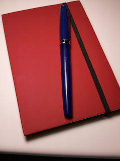
The ink I decided to use was Noodler's Red-Black and the pen, a Parker 51. My notebook of choice for this term is a Moleskine mid-sized notebook, which I have found is not conducive to feathering with either this ink or pen.  Now, using a Moleskine for taking class notes is not a new concept for me, but with this project I was much more interested than usual in keeping this notebook in as near to immaculate condition as possible. I happen to really enjoy the combination of cream paper, red-black ink (with beautiful shading), and the medium nib and flow of my Parker 51.  With ingredients as great as this, the end product certainly would be great.

Notes from Ancient Greek History class with my favorite professor!
It wasn't long before I found myself enjoying the writing experience more than ever before and finding excuses to write where I wouldn't have otherwise.  I found the experience to be interesting on a number of levels. I found myself really enjoying the time I spent writing, whether for class or fun, but I have to say that it went deeper than that.  I really found myself feeling a deeper connection to something greater than just the physical pen and paper.  I found that I had discovered a zen in writing. Yes, I feel silly thinking about it now, but it's the same kind of feeling that you get when you pick up a very old quarter and you think to yourself, "I wonder how many hundreds of people have held this coin?" It was being part of a greater writing tradition. There was something simple, antiquated, and gratifying to join the ranks of thousands before me.


During this month-long period, I found myself romanticizing what could be written with a fountain pen, and how so many authors/thinkers/inventors in the past had written with one as well.  The fountain pen is fundamentally different than a ballpoint because of what it symbolizes.  My only issue is that I feel this way about a pen.  How long ago would I have considered myself a total whacko for thinking this way? Through my fountain pen I can feel a connection to the past and to an era when the world was much more physical and more lived. So, yes, I feel stupid, saying it, but I would say I have developed a near spiritual relationship with my pen. The ink and paper are a significant part of it, but writing in a notebook for any reason is to almost enter into a trance. Paper, pen and author all become one. Its a feeling I'm not entirely accustomed to yet, but when the feeling washes over those of you who have experienced this feeling before, it is relaxing and invigorating and empowering all at the same time.

Eternally Inked,
The Classicist

Sunday, October 2, 2011

The Write Dudes: Retractable Ball Point

Retractable pens are the reason that I got started in fountain pens. Out of a severe frustration with pens that failed to write or even retract/detract the ball point, I switched entirely to a different utensil.  There are times however, when fountain pens can't be used, and for those times, I have come to love two pens: The Pilot G-2 and the Uniball Signo 207.  Both have excellent flow and excellent ink quality, though they are both gel pens.
Crisp and informative packaging. Definitely a plus.


The Write Dudes have tried to make a ballpoint pen that works well in the world of cheap pens. The best ballpoint pen that I know of is the Bic Atlantis, for balance, flow and comfort.  Unfortunately, these retractable ball points that were sent to me have none of those characteristics and are lacking in a few other areas too. Perhaps I'm not the right person to do a review of low-end pens, but among low-end pens, I think these are simply average. The color selection is poor and the plastic just feels cheap when you hold it. I have to say though, if having a pen that you don't care about is necessary for your use, then this might work.

From what I've encountered, many of the Write Dudes' products are pretty cheaply made and their logo is an exact copy of the Board Dudes, with one exception.  Their logo has a fountain pen in it, yet they don't make fountain pens! I simply cannot imagine this company making fountain pens, and I would be surprised if they did.
On the left side of the logo is the fountain pen. I'm so confused to see it there.


From the back of the package:

                  "Pick up this pen, hold it, write a word. Was that your life flashing before your eyes? Almost! It was everything you know about writing going out the window. Why? Super Smooth Ink is here to save you!"

Somebody in their marketing department certainly has a sense of humor.

  I'm not sure what they expected to accomplish with these pens, but it certainly isn't something that I would buy.  Then again, I am a person who won't accept mediocrity in a writing utensil and strive to use the best that I have available at all times. I was sent these pens to review, and I will not veer from my promise to offer an unbiased review, despite perhaps never being sent products to review again.  Regardless, I'm hoping to get a few more posts up soon, following my recent hiatus to being the school year.

Friday, August 12, 2011

Noodler's La Coleur Royale

There's just nothing like a good bottle of ink...
Some of my fellow pen enthusiasts understand what I mean when I say that even though I didn't need a new ink, I felt like it was about time for me to purchase one. Browsing the Goulet Swab Shop for hours comparing swabs was a lot of fun, but deciding which ink I wanted was difficult. I have a love for dark blue inks and La Coleur Royale, though not blue, fits into that dark category very well. 

Equipped with the usual Noodler's qualities and characteristics of good flow, durability after exposure to water, no showthrough (on good paper) and average drying time, the allure of this ink really comes down to color, and it really is a rich, soothing purple. I don't have other purples to compare this ink to, but I can say for sure that it is my second favorite ink, following Noodler's Red-Black. Though not a drawback for me, this ink doesn't have much in terms of shading, writing a very consistently colored line, even with an italic nib. But the color is so fantastic despite this!

One of my dilemmas when purchasing an ink is whether it will be useful in my life.  In the academic and professional world, a bright orange ink won't cut it, and sometimes there are just inks more suited for different environments and situations. Finding an ink that is professional and interesting at the same time is the reason I use my fountain pens in every academic task, because it brings me out of a rut of dull and boring pens and allows me to take extreme pleasure in every single word I write.

I don't necessarily feel like a king after using La Coleur Royale, but I certainly feel more distinguished.

Eternally Inked,

The Classicist
Noodler's Piston Filler on Rhodia paper...

Saturday, July 16, 2011

The Xonex Ru

It's nice to have some color!!


After receiving a Moleskine notebook as a gift a few years ago, I started to learn about the fantastic world of little notebooks.  I began to find little books all over the place and tested them as I found them. The Xonex Ru is intended to be an alternative to the Moleskine and in some areas, it fills that niche well.  I also must mention that I like the name, because the main feature of these notebooks is the pouch in the back. The "kanga-ru" is it's namesake, and I always enjoy creativity like this. And now, on to the notebook itself!

Just a bit bigger, but in the world of small notebooks, it feels like a lot
The paper, which is the most important part of a notebook like this, is much better than that found in Moleskines. With standard fountain pen ink, there is no bleedthrough.  There is some showthrough however, which I realize can be a dealbreaker, depending on your use.  Of other note is the cover, which isn't hard like the Moleskine's.  This cover is made from a latex infused cardboard, which is sturdy, but by no means as sturdy as most other little black notebooks. It does have a pouch in the back, which seems to be much more durable than that found on the Moleskine, and of course has a black elastic band to keep it closed.

At a third of the price of a Moleskine, it has some benefits and some drawbacks.  The most noticeable for me is that it is a little bigger than most black notebooks. As I mentioned before as well, it also isn't as sturdy, which depending on your use can be a problem.  The Ru comes in a few different colors, which I know is a problem some people have with Moleskines, but paper quality seems to be better than Moleskines, but not as good as Rhodia's notebooks. Overall, I think the notebooks are a good alternative to Moleskines, with different strengths and weaknesses.  I think that I'm going to use mine all the way before I make my final decision, but my Ru is definitely a contender on the notebook list.  Hopefully I can provide an extensive review with a full decision in the future, after extended use.

My only other issue with these notebooks is how scarce they seem to be. I found mine at The Container Store (of all places!), and I know that they can be found online at Amazon.com, but if you're anything like me, you don't want to buy a notebook brand until you can physically feel it in person.

I must note that the logo in the bottom right corner irks me somewhat...


Eternally Inked, 

The Classicist

Thursday, July 7, 2011

Noodler's Baystate Blue

Noodler's Baystate Blue is without a doubt the most controversial ink to be produced by an ink company.  It is both loved and hated with equal intensity in different circles. The color of this ink is modeled after one from the 1950s.  This is most likely the bluest blue that you will ever find. It's almost as if it's a highlighter type of color, but not in the neon range. It's a normal blue that resides in the range of highlighter intensity.  Amidst a line of plain black text, this blue ink will completely jump off the page.
 
There's just something special about brush pens...

With this amazing color comes some unfortunate side-effects, however.  The ink tends to stain plastics and nibs.  This eyedropper ink bottle comes with two pens. A platinum preppy .03 and a brush pen.  The platinum preppy performs as should be expected, but with a little ammonia, cleans up so that there is virtually no trace of the ink ever having been in it.  Ammonia is powerful stuff though, so care needs to be exercised when cleaning.  There is really no need to clean this pen, but I just tried it to see if i could.  It is now my dedicated Baystate Blue pen and will be until I run out of ink. The ink came with a Kuretake Brush Pen, which performs marvelously and is a lot of fun to write with. I don't plan on ever changing the ink in it either.

This ink's waterproof qualities are pretty good. Not bulletproof, but pretty good, a sacrifice completely worth making in return for the fantastic color.  The flow is good in my Noodler's Piston Filler and doesn't even dry up after a few days of sitting around. The ink behaves for the most part, just as well as Noodler's Polar Black.
This is an ivory paper, not plain white.


One of the most frustrating parts of this ink, due in part to my own foolishness, is that it tends to stick to my fingers despite a decent amount of washing.  The amount of hand-washing necessary to remove other Noodler's inks is not enough to remove Baystate Blue. I only really noticed when rubbing my fingers across papers or when touching plastics, as my fingers left blue smears across the surfaces, but it was annoying nonetheless. I just have to exercise more caution in the future.

Overall, I love this ink.  My own mistakes and the potential "drawbacks" of this ink completely pale in comparison to the sheer intensity of the color and the fun that you can have with it.

(Pen used: Sheaffer Italic F)

Friday, June 10, 2011

Caran d'Ache Ecridor 55

What evening ensemble wouldn't be enhanced by such a fantastic pen?

The elusive luxury pen.  Elusive for your average college student. I am still an average college student, but I got extremely lucky when filling out a fountain pen survey online and I was one of the selected winners.  Sometimes you just get lucky.  Maybe it's karma, or maybe it's just about time for the world to treat me well for once, but regardless. I won a magnificent Caran d'Ache Ecridor 55.  A luxury pen is within my reach for the first time in my life.  It is quite exciting.  The only pen that I have to compare it to is a Parker 51 (M), which is approximately 45 years old. I'll do my best to review it, but I have to say that luxury pens aren't exactly my specialty.

Extremely smooth medium nib, and it looks pretty too!
The Ecridor 55 is a pen that upon first glance is extremely stylish.  A fountain pen isn't a fashion accessory, but if you're paying enough money for it, it might as well be.  This pen truly fits that label.  Crafted from silver and rhodium, with a stainless steel nib, the Ecridor 55 has a beautiful "S" pattern that is meant to mimic the air intake "gills" of the 1967 Ford Mustang. I honestly can't attest to any similarities that I know of, but it is beautiful indeed.  I can really imagine this pen peeking out from a suit's front pocket.  I don't believe that a pen can define a person, but I do respect someone with a fountain pen... as long as it is being used.

Now, on to the writing experience, because a fountain pen is completely worthless if it doesn't write well.  I found overall that the Caran d'Ache Ecridor 55 was a fantastic writing experience, on par with the Parker 51 (but then again, I don't have tremendous experience with the world of luxury pens).  The balance of the pen is quite possibly the best that I have experienced in any fountain pen (cap posted or unposted), even better than my Parker 51. The nib is the critical part of the pen and this medium nib does not disappoint.  The nib is as smooth as the Parker 51 and the flow is a little bit slower, but not too much slower, so unless you're an artist or have an extremely quick hand, it's nothing to worry about.  The included adapter holds a lot of ink.  I've been running tests on this pen for about 3 weeks and have used almost 2 full legal pads and I've only refilled it 7 times. I have been using Noodler's Polar Black, my standard ink. I'm sure that in time I will find an ink that works best with this specific pen, but even with Noodler's Polar Black, this pen writes fantastically.

I would love to review more high end fountain pens, but unless they fall in my lap, that won't be happening any time soon. Regardless, I enjoyed the experience tremendously and look forward to possibly reviewing more in the future.

Eternally Inked,
The Classicist 

Friday, May 27, 2011

Waterman Black

It's not too often that I get an ink that isn't made by Noodler's. It isn't that I don't like other inks, it's just that I like Noodler's more.  The durability of the ink on paper is one of the most important properties of the ink in my eyes. For this reason, I almost always choose Noodler's. Though there can be some drawbacks to Noodler's inks, such as feathering and nib creep, the durability and flow in almost all inks are so dependable that they are still my primary ink choice, and that doesn't even factor in how many different colors there are to choose from.

Pretty good lookin' bottle, huh?
I figured that my first step away from Noodler's would need to be conservative so that I wouldn't be disappointed eventually, so I bought Waterman Black.  It's about the most standard black that exists in my opinion.  It's not Noodler's Heart of Darkness Black, but it gets the job done.  For me at least, that's pretty much where this ink falls. It's not super saturated, doesn't flow unreasonably well or resist water very well, but this ink gets the job done. It's an average, run of the mill "Bic Stic" type of ink.  The ink is thus extremely well behaved with no shading, bleeding, showthrough, bleedthrough or nib creep.  I actually would highly recommend this ink for someone just getting into fountain pens because this ink washes off very easily, behaves so well, and is relatively cheap.


One of the more interesting qualities of this ink, however is that after being exposed to water, the black ink sitting on top of the page washes off, leaving a blue layer on the page. This prompted me to look at the bottle in direct sunlight and I realized then that the ink looks like a nice blue-black in the bottle, but believe me, this ink doesn't exhibit a single trace of blue. Being a fan of blue-black inks, I probably would have appreciated that a little more, but sometimes there's nothing wrong with an ink that's just plain and ordinary. It's the things that are plain and ordinary in our lives that help us appreciate the things that are truly great, so I will get some great usage out of this black ink.

Aeterne Atramentus,

The Classicist

Monday, April 25, 2011

Staedtler Triplus Fineliner

My apologies for the brief hiatus in posts! Without further ado, here we go!

While I enjoy the Pilot G-2 and other ballpoint and gel pens, I have found that none of them suffice when I want the feel of a fountain pen.  The ability to write with a light touch and create flourishes is almost exclusive to fountain pens, with the exception of fine point markers.  The Sharpie Pens are one of the best examples of fine point markers that can fill a similar niche as fountain pens. They are not anywhere near as prone to leaks as fountain pens and are suitable for tossing into a bag and forgetting about until you need them.  While there are a lot of markers out there that are advertised as pens, it is not always the items shoved in your face that are on display at the store that work best. Enter the Staedtler Triplus Fineliner!

I love the color and precision of marker pens.


I was searching for writing utensils around Chicago and the suburbs and stumbled into the marker section and tested some pens, pencils and markers.  I purchased three of these pens while at a Dick Blick art store in Chicago after a brief writing test. The blue, being my favorite ink color, has been entirely used up and as such is no longer with us. Green and Black, however are still going strong. These are art markers. They are not marketed as pens, but serve exceptionally well as pens. My standard for comparison in this area is the Sharpie Pen, seeing as they are very popular and there are many reviews for them online, so here comes the review:

You can really see how long and skinny this pen is when compared to a Pilot V Razor Point
This pen is longer and skinnier than most pens which I come across and is obviously skinnier and longer than the Sharpie Pen.  The pen can really feel uncomfortable in my hand at times, but I can't be sure if it's because of the unique triangular shape of the barrel or because of its width. The tip is the perfect hardness in my opinion, being just a bit softer than that of the Sharpie. It has not disintegrated after months of use and has retained its shape, allowing me to continue to write with a fine point. The most important point for comparison here is color, seeing as the Sharpie Pen's "green" is a disgustingly light and turquoise that was a huge let down for me.  The Staedtler has a color of green that is pretty much spot on what I imagine standard, average, real green to be. The black is on par with the Sharpie Pen in terms of color. The ink doesn't bleed through on Moleskine paper and doesn't show through at all. The ink also dries really quickly as well, so you don't have to worry about smearing, you lefties out there.  There is no odor, making this a very useful art marker and in this case, a fantastic pen.

When you can't carry a fountain pen with you for fear that it would leak or break, carrying a marker pen with a fine point can act as a fantastic substitute.  With the exception of potential barrel comfort issues, this pen can become a daily workhorse or eternal backup in your bag.

Wednesday, April 6, 2011

PennedHouse Double Feature: My Ink Blend and Pilot Petit1 Conversion

The Pilot Petit1 is a fantastic fountain pen that is similar in size to the Stipula Passaporto, and is extremely small with the pen cap on, but with the cap posted is a comfortable fit in my hand.  The nib is very smooth for a fine point pen, especially one that is as cheap as this pen is.  My big problem with the Petit1 as a daily writer is the size of the ink cartridge. While refillable, the ink cartridge barely holds enough ink for the amount of writing I encounter during the day. I was thinking that there must be a solution!

From the desire to increase the ink supply of the Pilot Petit1 came the following experiment.  My goal was to convert the Petit1 into an eyedropper pen, but along the way I got curious and started creating my own ink which, for which the recipe will be posted next week. Back to the Petit1 though, it wasn't really a whole lot of work doing the conversion.  The biggest problem I encountered was figuring out how much silicon grease I needed to prevent ink from leaking all over my fingers.  It took a few days to figure it out, but once I did, there were no problems whatsoever.

The fruit of my labor!

The ink color I ended up creating is a dark teal, which is similar to one of my most desired inks. Noodler's Coral Sea Blue is exclusive only to Australia and as such would cost a LOT of money to ship to America, not to mention that a bottle before shipping costs $39.95 in Australian dollars! I knew I would never be able to get my hands on a bottle unless by some miracle, so I combined different amounts of blue, black and green inks to get the ink in the pictures, which matches up almost perfectly with Coral Sea Blue.

This is probably my favorite color of ink now.


The results of both experiments were successful and should keep me occupied for a while, which is both a good and bad thing.

Wednesday, March 30, 2011

The Parker 45

You can see the slight curvature of the barrel in this picture.

Greetings from Augustana College! Baseball season is underway even though there is still freezing weather predicted for the next week.  I apologize for the slight delay in this post, but my schedule has been hectic as of late.

My uncle's reward during service week in Singapore.
This wonderful fountain pen was awarded to my uncle in 1976 for volunteer work for the Singapore government. What a gift it was!  It hearkens back to a day when a prize/award was useful and didn't just sit on a shelf like a trophy.  I found it in my basement along with the rest of my older pens and this one was in the worst condition of the bunch.  That's really not saying much, seeing as it still has the tag on the clip! 

Upon initial inspection, this pen has a slight bend to the barrel, which does not inhibit the writing process whatsoever, but does look weird at times.  I can't be sure of exactly what caused this warped body, but it was either great force or a combination of that and heat.  The filling mechanism of this pen was stained black, but had very little encrusted ink within.  This pen was taken care of, though less than my Parker 51 which I reviewed here.

Until I get the opportunity to inspect the rubber on this pen and replace it, I'm not going to use this pen as anything but a dip pen.  I don't want to risk a spill in my pen case or major leaks and spotting on a homework assignment. It's unfortunate, but I already have a TON of pens that I carry around with me everywhere.


Red-Black, you never cease to amaze me!

I do like the color of this pen, and I actually wish I had a pen with a green barrel that I could use on a daily basis, because I usually end up buying blue pens. The nib is a smooth writer indeed and not completely different from that of the Parker 51, granted however that I am using it as a dip pen. The balance of this pen isn't terrific because of the materials used in making it (let's get real here, it's not a higher end pen).  Posting the cap partially brings balance back to this average pen, but it's still darn good and holds a lot of meaning and history.  Overall, I'm happy to continue using this pen for writing letters and taking notes at my desk, but there isn't anything about this pen that blows me away. 

Χαιρετε παντες!

The Classicist

Wednesday, March 16, 2011

Noodler's Polar Blue Part II


I've gotten much use out of Noodler's Polar Blue in the past few months, but the review that I did a while ago was lacking the more rigorous of the ink evaluations that are sometimes needed. Well, I figured I would do this full review of the qualities of the ink for those of you who are looking for a nice blue to use. I'm continually on the search for blue inks and I don't often find myself bored by them, which led me to purchase Noodler's Baystate Blue, which has blown my mind in every way. That's a post for another time though.  I bought the 4.5 ounce bottle online and it came with a free fountain pen (a modified Platinum Preppy .3)

"Noodler's Polar Blue is pretty standard in color, but can seem washed out at times. It almost seems to be chalky, especially when compared to other blues, specifically Baystate Blue.  After months of usage, I have not found this ink to feather, even on cheaper paper.  the included fountain pen has gotten a lot of usage and has performed like a champ.  The 'bulletproof' qualities of this ink are true after a bleach test. I have not tried this ink in any other pens because of the warning that it might stain pens (which others can attest is true).  If I remember correctly, this ink has often been compared to luxury blue in the Noodler's line, but I don't own it and can't make the comparison. I highly recommend this ink." 

I've taken many many pages of notes with this ink.

Friday, March 11, 2011

The Addiction: Explained

I am a member of a community of pen enthusiasts. I realize that many of us really enjoy just using pens, but for some of us, it goes much farther than that.
I carry all of these around with me everywhere I go!

I'm addicted to pens, but this post will cover a small niche of that area, specifically fountain pens.
I am a college student, so my hard earned money almost all goes into my savings account, but I allot myself a certain amount for pens each month. I am sometimes forced to combine my allotment for two months so that I can make a purchase. This is my method for enabling my habit. The rush of opening a box from jetpens.com or gouletpens.com is without compare.

I rationalize my habit in a number of ways:

1. I have a few bottles of ink (8) and I am often asked, "How long does it to to finish a bottle of ink?" It usually takes me quite a while to finish a bottle, and they don't seem to understand why I have so many. What they don't understand is that there are different inks for different scenarios. Different colors are appropriate for work and letter correspondence. Why should my life be drab and defined by one color? Using one color for a long time, no matter how vibrant, makes it become dull. I enjoy the variety and vibrancy that a reasonably sized ink collection provides.

2. As Nathan Tardif has stated, the price of ink (specifically Noodler's) are the cheapest per ounce on the market. Assuming a comparable pen, such as a G-2, costs $2.00, then a 4.5 ounce bottle of ink holds the same volume as that of 75 pens. The savings are ridiculous, even if you have many different ink colors. You just have to use them all to get the savings. It's a good motivation to write.

3. In regards to the number of fountain pens I own, I not only value each pen that I own, but appreciate being able to write with any ink at any time.  Having a pen ready to write for each ink that I own is a luxury, I realize, but it is also a necessity.  It allows me to easily grab notebooks by scanning a page, because I use different inks for different subjects.

I really liked the lighting in this picture, even though it is pretty much the same picture as above. :)


4. Part of the reason that so many of us in this community are interested in these niche pens is because they're far more interesting than the standard disposable pen and better for the environment. Our words are interesting, so shouldn't our writing instruments be too?


5. Last and most importantly, I feel like I'm more of a part of history.  Everything that I write (especially in the Classics) owes much to the past.  Writing is just that much more enjoyable knowing that I'm part of a great writing tradition.


I look forward to many more years of fountain pen enjoyment and feeding my addiction.  I'll also be sure to pass it on to others. Maybe I'm not addicted. Maybe I'm in love.

Sunday, February 27, 2011

Pilot G-2 .5 vs. UniBall Signo 207

Greetings from Memphis, Tennessee! As the Augustana College Baseball team is traveling down to Florida, we have stopped at Rhodes College for a 14 inning scrimmage to ease into the season. (I started this in Tennessee, but I'm now in Florida and our Varsity team is 3-0!)

What a great looking threesome! .

Self proclaimed to be the "#1 selling gel pen in the U.S.", the G-2 made by Pilot is without a doubt the most dependable non-fountain pen that I own.  The ink flow is fantastic in every iteration (1, .7, .5, .38) and the pens are fantastically balanced.  Is this pen really the best in the market though? Thinking about it, I realized I wasn't that certain of the mainstream competition in the U.S. market and how it stacked up.  The primary competition that I was able to find was the UniBall Signo 207, which interestingly enough claims to have fraud preventing ink.  This also intrigued me because of my interest in the fraud protection that Noodler's Inks offer. The evaluation shall begin!

Before I get to writing quality, I have to say that I am a pen spinner. Whatever non-fountain pen that I use needs to be balanced well and not have ink that is easily jostled from the tip of the pen. The result of the occasional drop is at least one gap in the ink reservoir and skips in ink flow. Nothing bothers me more than poor ink flow. The Signo 207 suffers from this problem while the G-2 doesn't.  Right off the bat, this makes the G-2 superior in my eyes, but as to general ink quality and fraud prevention, that remains to be decided.


These pens glide very well over Moleskine paper.


In my tests of water solubility on normal notebook paper both inks held up extremely well after being soaked in water.  As I am not at home, I don't have access to the standard cleaning solvents which I would use to test these inks. The fraud prevention of the Signo will have to be evaluated later to see how it compares to Noodler's. You can be sure you'll see it soon!

Now, here's the final conclusion. Since the Signo 207 has a wetter ink flow and design that is a little more comfortable than the G-2, I give it the win. The G-2, while having excellent balance, offering different sized ballpoint tips and far more colors than the Signo 207, is ever so slightly drier of a writer. The ink in the Signo doesn't last as long as the G-2, but I'm willing to sacrifice that for a wet writing pen. You lefties out there might not be as happy with it, but I'm guessing for most of you, gel pens don't cut it.

I'm very excited to return to Illinois, because waiting for me is a package from gouletpens.com. I have decided to bite the bullet and try some Baystate Blue. I can sum up my emotions in one word: stoked.

Note: I do realize for the comparison that I have used a G-2 .05 and a Signo 207 which is more like a .7 tip. I have used many many G-2 .7's, so the tip size didn't impact my verdict.

Monday, February 14, 2011

The Majesty of the Italic Nib

I imagine this was a reasonably cheap pen, because
of the simplicity of its design, but the value of the basement-found
pen is ridiculous!
To the best of my knowledge, this Sheaffer fountain pen is just a generic pen. There is nothing special about the body of the pen or the clip or the weight balance or even the nib.  Basically, this pen is about as normal as can be.  The one difference that this pen has from any of the other pens that I own is that it has an italic nib. The difference that the nib makes in my writing is unbelievable.


What makes this pen write so differently is that instead of coming
to a point, the nib is wide and flat. Genius.

Having been in love with fountain pens for a while now, I'd become fairly comfortable with how I was using mine. Schoolwork was getting done and inks were fun to play with, but I'd never really looked too much into calligraphy, mostly because it was more time consuming and for the most part impractical for my uses. Among the fountain pens that I found in my basement however, was an italic nibbed pen, and I can't believe how much fun it has been!

It isn't that my handwriting is lacking too much, or isn't "pretty" but as far as calligraphic styled writing goes, the italic nib makes a world of difference. After trying a couple times with my Noodler's Nib Creaper Flex Pen, but getting very few results for calligraphy, I tried using this pen and found that this type of nib simply forces you to write "prettier". By widening the lines of the downstrokes and narrowing pretty much all horizontal strokes, your handwriting can very easily look pretty.
Noodler's Axmatoba on plain notebook paper.
The nib isn't scratchy and writes reasonably wet, but I've only used it as a dip pen because I don't think I could ever pick just ONE color to use in this pen. I believe this pen would easily convert to an eyedropper because the barrel just seems to screw on.  If I could find some ink that I absolutely loved (Black Swan in Australian Roses most likely) then I would probably just leave it inked all the time and enjoy the absolutely huge ink reservoir at my disposal.

Writing with this pen has been so much fun. I strongly recommend that anyone who has not tried writing with an italic nib to do so. Even if you're not interested in calligraphy, I'm sure you'll find it just different enough to be fun.

Monday, January 31, 2011

Noodler's Blue Ghost

I apologize for the brief hiatus in blog posts, but a combination of school and college baseball have been a bit trying on my already hectic schedule. Hopefully I'll be able to get back on the horse and get more posts up!

Invisible ink. The tool of secret agents. Those of us ink nerds who aren't secret agents, I have a few questions for you. Do you deal with everyday problems such as forgetting account passwords, writing in borrowed books, writing in your own books (it bothers me at least) or glowing in the dark at parties! If so, this is the ink for you!

I promise to get a picture of actual writing with this ink
up soon, but since my photography capabilities are limited,
I should be able to edit it tomorrow!
A few weeks ago, I purchased from gouletpens.com a 4.5 oz bottle of Noodler's Blue Ghost. I have been extremely curious about the UV qualities of many of Nathan's inks and as such, I was curious about this ink specifically because it is viewable in ONLY with the aid of a blacklight.  What could I possibly use this ink for?  Being ever the child at heart, writing secret messages to people immediately jumps to mind, even though realistically, I don't have anyone who would go through the trouble to read them.  The idea did spring to mind in a class with teacher who I especially dislike, that I could tell her in my own words on a homework assignment how I truly felt about her teaching and let her have it.  It would truly be a great exercise in stress relief... assuming my teacher never finds out.

One of the most interesting properties of this ink is that it is bulletproof. This ink is very difficult to wash off of your hands, but who's going to be seeing it anyway? On paper, the ink flows as well as expected from the included Platinum Preppy .03 and is as visible as expected under the blacklight.  The ability to write in glowing letters in the dark is really cool, and if I could video the process, I would, but since my only camera is my cell phone, it would be pretty difficult to do.  I suppose the possibilities aren't endless with this ink, but I suppose if you did want to make an ink uniquely yours, you could add this to it. There's no guarantee that the ink would remain bulletproof however, since they're very fragile in the aqueous state.  This ink without a doubt rocks the world of invisible inks.  Also, it isn't a ballpoint pen, so you don't have to worry about the telltale pressure marks left behind.

I can at least pretend to be the next James Bond, but who knows maybe I'll catch Anna Chapman's eye.

Eternally Inked,
The Classicist

Monday, January 17, 2011

Best Fountain Pens for writing the Arabic Language

One of the reasons that I find fountain pens to be useful is because they're the ultimate writing tool.  Not only can they be used for writing, but they can be used for drawing as well. They're the ultimate calligraphy tool, seeing as calligraphy is the art of writing.  Tracing the roots of the word calligraphy, we arrive at the Ancient Greek word καλλιγραφος which is a combination of the Greek words καλος and γραφος.  Καλος means "good" or "nice" and γραφος means "writing" or "letter". Together we get a word that means "nice letter".

I'm not good enough at reading Arabic to know what this
says, but it sure looks REALLY cool!
Now, Arabic is a language that is different from what we are accustomed to in English, because the script for the language is much more common as an art form.  Because of the religious devotion of early followers of Islam, the people in the Middle East were afraid to draw pictures out of fear of creating idols, something that The Prophet Muhammed warned against.  Searching for an outlet for creative endeavors, the Arabic speakers (since Islam and the Arabic tongue are inextricably connected) put all their energy into mathematics, architecture and handwriting.  The Arabic script can be as beautiful as English cursive or more beautiful.  Both have a lot in common in the way that they flow and rise and fall with twists of the pen and more pressure on down strokes.  While ballpoint pens may work alright with the Arabic language, a pencil is preferable over a ballpoint and a fountain pen over a pencil.
Practicing my Arabic alphabet. Each of the
28 letters has 4 different forms that must
be known. That doesn't even count the short
vowel marks.

I've been trying different fountain pens to see which ones work best with the Arabic language.  The Sheaffer Italic that I used was probably the best one overall, but as far as standard pens that I would carry around with me for use in other languages, I would say the Noodler's Nib Creaper Fountain Pen (filled with Noodler's Bad Green Gator) performed the best.  I was also able to apply more pressure with the throw-back nib and make line width variations, placing it at the top of the list for writing Arabic.  My Platinum Preppy .03 was the runner-up. It was filled with Noodler's Polar Blue.


I tend to use legal pads most of the time because of their convenience and price. Don't worry, I'm moving to bagasse paper as soon as I run out!  This pad has narrower lines than most and as such, wet writers or pens with medium nibs aren't as functional.  This isn't to say that the Parker 51 (medium nib/Noodler's Polar Black) that I used or the Pilot Petit1 (wet writer/Noodler's Polar Blue with a drop or two of Polar Black) aren't great for this writing, but they most certainly need more line space than this legal pad allows.  Other pens I used were my Lamy Safari with EF nib (filled with Noodler's Polar Black and my Noodler's Piston Filler (filled with my favorite ink, Noodler's Red-Black).  Both the Lamy Safari and Piston Filler were too scratchy for a comfortable flow that is necessary for the lines prevalent in Arabic. The Sheaffer Italic F was used as a dip pen in Noodler's Russia Series Ахматова.

I'm a student of the language first and foremost, not a calligraphist, but that doesn't mean that I can't have fun with practicing calligraphy in other languages from time to time.  Maybe someday I'll be able to write as well as in the picture above.
مع السلامة

The Classicist

Sunday, January 9, 2011

Noodler's Red-Black

I discovered this ink while perusing the Swab Shop at gouletpens.com and I found it to be one of the most interesting colors that I could remember ever seeing. Reviews of the ink weren't really prevalent, so I got it at somewhat of a risk.  I have not been happier with an ink color and it is without a doubt my favorite ink.  It truly is a half and half combination of red and black inks that has some of the best shading that I've ever encountered.  The ink writes fairly wet and tends to behave on cheap paper just like a good ink should.  On Moleskine paper, the ink behaves very well, with no feathering, but average bleed through to the back of the page.


This ink has an incredible amount of depth when using an italic nib.  The colors of this ink look even more incredible on Moleskine paper, since it is ivory colored.2 This ink is extremely comparable to Waterman's Havana. At first glance on paper, the ink looks brown, but upon further inspection proves to have a stunningly deep mix of colors.  It could be compared to Private Reserve's Black Cherry, but that ink has very little shading, despite that it looks much more like a dark red. Noodler's Red-Black is definitely not a dark red, but exactly as its name states, a 50/50 mix of red and black.  This is my favorite ink for writing letters and for note taking as well.  This is not a color that I ever expect to be able to find in any rollerball pen and is so unique that every word I write seems just as unique and deep.

Walking into class on a snowy day, I accidentally dropped a vocabulary sheet on the ground and minutes later found it under my wet shoe. The red ink was running down the page and away from the letters I had written, but the black appeared to stay in place. I believe that the black in this ink is bulletproof and the red is not, as is common in many of the colored Noodler's inks that are bulletproof.

At times, this ink can look like almost like a blood red. Not, that I'm a morbid person, but I think it's one of the coolest colors I have encountered.  Fans of poorly written vampire novels (Twilight Series) rejoice!  Now you too can write vampire love letters in "blood", as vampires did before texting.

Eternally Inked,

The Classicist

Saturday, January 8, 2011

Nomadic VS-01 Virgo-Attrezzo Standing Pen Case


The Virgo-Attrezzo reminds me of the Burj Al-Arab in the UAE


As the number of pens in my daily arsenal has increased, I have found myself wanting to prevent the loss of any pens and prevent jostling and subsequent ink leaking.  I also like to have a couple pens inked for certain classes and then in addition, have pens I can loan out, because of those non-fountain-pen users out there who want to borrow pens or pencils.  If I have the time I will teach people how to use a fountain pen, but they're usually uncomfortable trying it. I used to only carry a few pens around with me, but now that I have this case, I don't worry about carrying anywhere from 6-12 with me on the average day.  A pen case does make it easier to carry them around worry-free.  Now I have only to worry about losing the pen case.

Convenient little compartments
I bring this case with me everywhere and keep it tucked away on a pocket on the side of my messenger bag.  This type of bag is particularly useful because it stands on its own and can be peeled back to remain open, displaying the pens at your disposal.  This holds 12 pens, an eraser, 2 lead sleeves, and potentially a bottle of Noodler's Ink (or an undetermined number of pens if you prefer.  I don't usually walk around with a bottle of ink, but if I ever need to, I know that I can carry the bottle I use most around with me.  Today that's Noodler's Bad Green Gator.

Lamy Safari, Noodler's Nib Creaper Rollerball,
Converted Preppy .03 Eyedropper x 2, Parker '51,
Pilot Petit1,  Uni Kuru Toga, Pilot Frixion .4, Pilot AirBlanc
, Hero 285, Noodler's Nib Creaper Fountain pen,
Sheaffer Imperial II Deluxe, Noodler's Bad Green Gator.
Two lead sleeves fit as well as an eraser!
As far as design goes, this case is perfectly made out of extremely durable materials and is stylish, but does not challenge my masculinity.  I address that challenge to masculinity here though.  I specifically ordered this in black because it seemed like it would be the manliest of the bunch.

I've been looking at pen rolls, but they cost way too much money or they aren't practical for me. If the pens you use are mostly fountain pens or tend to be mostly in the upper price spectrum, that would probably be better because the pens are more likely to bump into each other in the Virgo-Attrezzo. For the price, this has been the best value I've encountered, especially considering that it was the cheapest of its kind that I was able to find.  A tip of the cap to Nomadic for a very well made and extremely practical pen case.

Tuesday, January 4, 2011

The Carnival is in Town!

Check out this month's Carnival of Pen, Pencil and Paper at pocketblonde.blogspot.com! There are some really good posts from other bloggers out there! Hopefully I will have a new post up tomorrow too!
Published with Blogger-droid v1.6.5

Monday, January 3, 2011

Noodler's Empire Red (UK series)

       The last of the inks I received for Christmas, Noodler's Empire Red, was an ink that first drew my attention because of its label. Noodler's inks usually have fantastic labels, but this one is particularly good.  In some instances you can judge a book by its cover.  I was also drawn to this ink because of its eternal qualities, because I use inks for schoolwork and can't have them coming off a page if it's a bit rainy outside.


They are a nice couple aren't they?

This ink is extremely smooth and writes a little wet on the page.  I'm amazed that this ink writes on Moleskine paper really well, just like Noodler's Axmatoba, which I recently reviewed here. There is no feathering on even cheap papers and the ink behaves very well in the few pens I tried it in.

The ink label that could stop a man in his tracks...

This color is pretty unique as far as reds go. It's paler than an ordinary red and isnt as dark as a standard red. It has pretty much no shading at all and dries after a couple seconds. I was surprised to have found that this pale red ink turned a sickly yellow-white under a blacklight. This led me to believe that this ink is a combination of standard red and Noodler's Whiteness of the Whale. I imagine it wouldn't be too hard to mix this ink with the right ingredients. I'm looking forward to trying some of the other inks in this series, such as Queen Victoria's mint and Socrates, but especially the latter because it seems like it will be a very unique ink with great characteristics.

Edited to add water test picture!

Aha! Finally an ink for comparison. Noodler's Red-Black will be featured soon!
You can somewhat see, how in the center of the blacklight,
 the ink "whites" out. Thar' she blows!
After a 5 minute soak, the ink held up exceptionally well!

Sunday, January 2, 2011

Sheaffer Imperial II Deluxe

Ah, the majesty of the unfurnished basement.  Upon its shelves can be found treasures beyond your wildest dreams strewn amongst the greatest junk one could ever find.  I haven't even fully searched the entirety of my basement, which means that there may be more vintage fountain pens and other gizmos and doo-dads.

Eye candy...
The next in the series of pens I found is the Sheaffer Imperial II Deluxe.  The pen's barrel is a very nice blue that feels comfortable in the hand, just like so many of the other vintage pens that I have been using.   Perhaps it is due to that "worn-in" feeling, but every pen thus far feels as if it has a unique personality of its own.  I intend to get to know each pen better, but for now, back to the Sheaffer.

This pen is somewhat similar to the Parker 51 in body design
but the nib and filling mechanism are different. The Parker 51
is a classic pen, but this Sheaffer is a pen that is similar and
cheaper.
This pen was found in fantastic condition, needing very little cleaning.  A quick inspection of the parts and then rinsing of the black rubber filler and I was ready to write and practice some language, but I wasn't sure which one, so I tried a couple. I found this pen worked really well for Arabic, because it has a smooth medium point nib.  This nib is absolutely fantastic and is much better than the medium nib that I have for my Lamy Safari.  I used Noodler's Empire Red which is a very smooth ink too. The combination was without a doubt one of the best combinations that I've been able to find for an ink and a pen.

 The Sheaffer Imperial II Deluxe is a pen that is made predominantly of plastic and as such weighs very little, and is a bit lighter than you would guess just by looking at it. A distinguishing feature of this pen is the smaller clip on the cap, which does make it a little less useful in a pocket, but still keeps it from rolling around.  The filling mechanism was new for me, but I absolutely loved it.  It's called the "Touch-Down Method" in which you pull the end of the pen out and then push it back down.  The trick to getting this to work is to leave the pen in the ink bottle for a few seconds after the lever is fully depressed because that is when the ink is being drawn into the pen.

                                                              Long live the vintage pen!

Bad Green Gator feathers a lot on Moleskine Paper and with a wet pen, but this pen is still fantastic.