Sunday, February 27, 2011

Pilot G-2 .5 vs. UniBall Signo 207

Greetings from Memphis, Tennessee! As the Augustana College Baseball team is traveling down to Florida, we have stopped at Rhodes College for a 14 inning scrimmage to ease into the season. (I started this in Tennessee, but I'm now in Florida and our Varsity team is 3-0!)

What a great looking threesome! .

Self proclaimed to be the "#1 selling gel pen in the U.S.", the G-2 made by Pilot is without a doubt the most dependable non-fountain pen that I own.  The ink flow is fantastic in every iteration (1, .7, .5, .38) and the pens are fantastically balanced.  Is this pen really the best in the market though? Thinking about it, I realized I wasn't that certain of the mainstream competition in the U.S. market and how it stacked up.  The primary competition that I was able to find was the UniBall Signo 207, which interestingly enough claims to have fraud preventing ink.  This also intrigued me because of my interest in the fraud protection that Noodler's Inks offer. The evaluation shall begin!

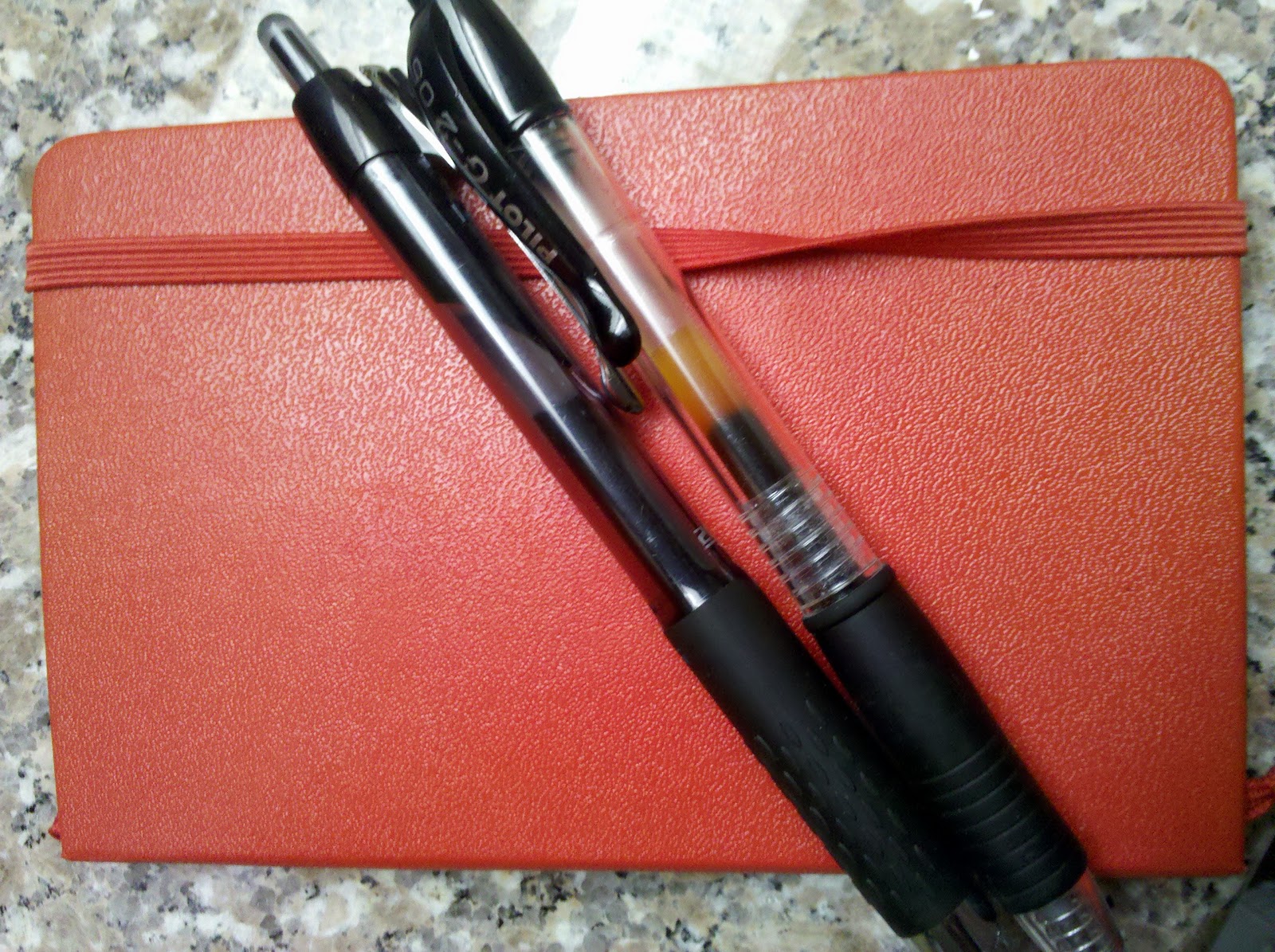
Before I get to writing quality, I have to say that I am a pen spinner. Whatever non-fountain pen that I use needs to be balanced well and not have ink that is easily jostled from the tip of the pen. The result of the occasional drop is at least one gap in the ink reservoir and skips in ink flow. Nothing bothers me more than poor ink flow. The Signo 207 suffers from this problem while the G-2 doesn't.  Right off the bat, this makes the G-2 superior in my eyes, but as to general ink quality and fraud prevention, that remains to be decided.


These pens glide very well over Moleskine paper.


In my tests of water solubility on normal notebook paper both inks held up extremely well after being soaked in water.  As I am not at home, I don't have access to the standard cleaning solvents which I would use to test these inks. The fraud prevention of the Signo will have to be evaluated later to see how it compares to Noodler's. You can be sure you'll see it soon!

Now, here's the final conclusion. Since the Signo 207 has a wetter ink flow and design that is a little more comfortable than the G-2, I give it the win. The G-2, while having excellent balance, offering different sized ballpoint tips and far more colors than the Signo 207, is ever so slightly drier of a writer. The ink in the Signo doesn't last as long as the G-2, but I'm willing to sacrifice that for a wet writing pen. You lefties out there might not be as happy with it, but I'm guessing for most of you, gel pens don't cut it.

I'm very excited to return to Illinois, because waiting for me is a package from gouletpens.com. I have decided to bite the bullet and try some Baystate Blue. I can sum up my emotions in one word: stoked.

Note: I do realize for the comparison that I have used a G-2 .05 and a Signo 207 which is more like a .7 tip. I have used many many G-2 .7's, so the tip size didn't impact my verdict.

Monday, February 14, 2011

The Majesty of the Italic Nib

I imagine this was a reasonably cheap pen, because
of the simplicity of its design, but the value of the basement-found
pen is ridiculous!
To the best of my knowledge, this Sheaffer fountain pen is just a generic pen. There is nothing special about the body of the pen or the clip or the weight balance or even the nib.  Basically, this pen is about as normal as can be.  The one difference that this pen has from any of the other pens that I own is that it has an italic nib. The difference that the nib makes in my writing is unbelievable.


What makes this pen write so differently is that instead of coming
to a point, the nib is wide and flat. Genius.

Having been in love with fountain pens for a while now, I'd become fairly comfortable with how I was using mine. Schoolwork was getting done and inks were fun to play with, but I'd never really looked too much into calligraphy, mostly because it was more time consuming and for the most part impractical for my uses. Among the fountain pens that I found in my basement however, was an italic nibbed pen, and I can't believe how much fun it has been!

It isn't that my handwriting is lacking too much, or isn't "pretty" but as far as calligraphic styled writing goes, the italic nib makes a world of difference. After trying a couple times with my Noodler's Nib Creaper Flex Pen, but getting very few results for calligraphy, I tried using this pen and found that this type of nib simply forces you to write "prettier". By widening the lines of the downstrokes and narrowing pretty much all horizontal strokes, your handwriting can very easily look pretty.
Noodler's Axmatoba on plain notebook paper.
The nib isn't scratchy and writes reasonably wet, but I've only used it as a dip pen because I don't think I could ever pick just ONE color to use in this pen. I believe this pen would easily convert to an eyedropper because the barrel just seems to screw on.  If I could find some ink that I absolutely loved (Black Swan in Australian Roses most likely) then I would probably just leave it inked all the time and enjoy the absolutely huge ink reservoir at my disposal.

Writing with this pen has been so much fun. I strongly recommend that anyone who has not tried writing with an italic nib to do so. Even if you're not interested in calligraphy, I'm sure you'll find it just different enough to be fun.